
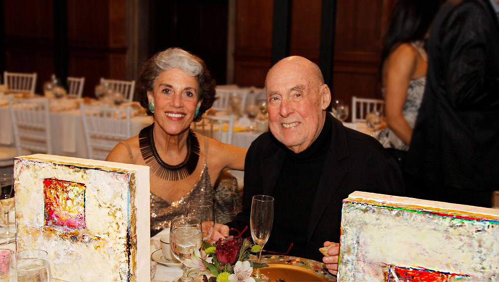
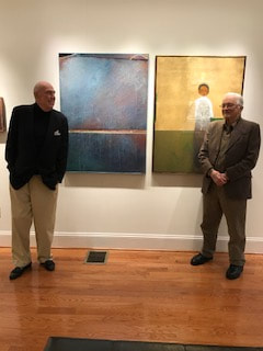
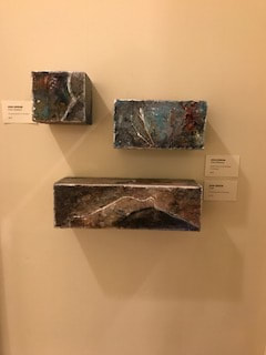
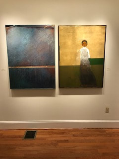
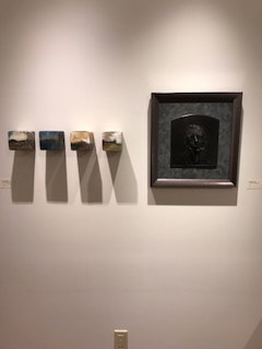
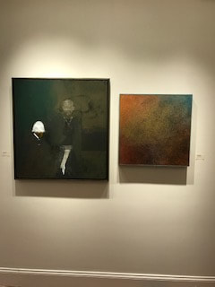
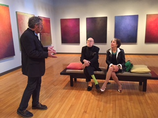
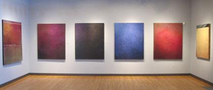
Re-Emerging Artists: John Greene and Robert Marx
Main Street Arts, Clifton Springs, NY, April 2017
Main Street Arts, Clifton Springs, NY, April 2017
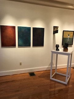


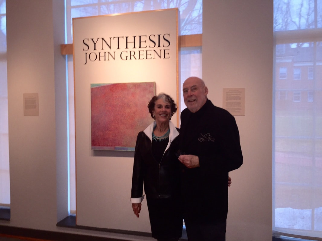
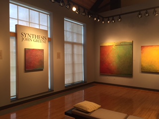
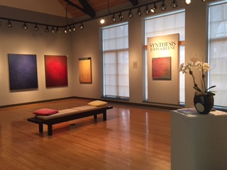
"Synthesis" by John Greene
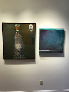
Exhibition at the Warner Gallery in the Holbrook Art Center, Spring 2015
Viewer Feedback
"The simultaneously rich and minimal palettes of these paintings often achieve a lyrical, poetic beauty."
(Jonathan P. Binstock, Ph.D, Director of the Memorial Art Gallery Museum, Rochester, NY)
"Your show was superb. It really dominated the room with grace and ease." (Walter and Joyce Thompson)
"Oh, what a lovely, glorious exhibition. Each of the paintings drew me in. Aren’t we all lucky that John decided to quit Wall St. and start painting? If he hadn’t, we wouldn’t be able to go to these extraordinary shows. And we wouldn’t have three of them hanging in the living room...John’s paintings truly do enrich my life." (Anne Gillis)
"The colors are extraordinary as well as the textures." (Barbara Field)
"...The [paintings] add intense joy to my sense of well-being. I am so happy you are continuing to grow
in your painting - I see more abstraction, distillation of essences in this particular exhibit and love it!"
(Friederike Seligman)
"Has a metaphysical transcendence which is very uplifting to ones consciousness." (Frank Martucci)
|
|
|
Reviews In Print
John Greene’s Millbook Exhibition
Alexander Shundi 2015
Sensation is defined (as is perception), as a primary stage of processing the sense in the human system. Stimuli either from the mind as from the body, and its awareness, is a blessing when it offers pleasure to the eye.
In John Greene’s paintings, it invades our mind with a dance of beauty. Yes, the paint is part of the thrill, with its miasmatic texture and flow, its first offering of what’s to follow. That flat and loaded surface, as if by magic, soon changes into a space-scape of illusive atmospheres and currents. It blooms dense with a sensation not unlike a heart beat, in this case accompanied by an eye-march into a beautiful visual poem of refines color rhythms. It is a sensation of pleasure in itself, not an illustration of familiar objects or instances that are recognizably so, but the essence of the feeling. John offers a meditative journey into a vision of pure poetry.
One fantasizes that in order to make these panels, it would be instrumental to allow a calm and emptiness to make room for the delicate birth of these sensations, unencumbered by the physicality, politics, social worries, and commitments, and general functioning instances dictated by the exigencies of life. The creation of these pieces demands contemplation of what lies beyond the commonalities of life lived. And the viewer feels it. Those seemingly endless little drips and bumps forming a textured, galactic surfaces that gently sway us from one zone of color to the next: tenderly, subtly, almost affectionately, serenate our senses and carries us on a journey of beauty.
|
|
"John Greene is a master of color. He is also a master of most of the other visual arts including sculpture, collage and mixed media. But dazzling colors are what first strikes you..." (The Millbrook Independent)
The Millerton News, Thursday, April 23rd, 2015
Familiar Technique, with Texture Added
The Art Scene: Leon Graham
John Greene is the only artist I know who worked on Wall Street by day and painted in a West Village studio by night. Long retired and living in Pine Plains, NY, Greene still makes art, and a small exhibition of his luminous color field paintings is now in the Warner Gallery of the Holbrook Arts Center at Millbrook School.
Color field was an artistic movement of the 1950s and ‘60s. Characterized by large, flat swathes of color, it was manipulated in many different ways by artists such as Mark Rothko, Barnett Newman, Helen Frankenthaler, Robert Motherwell and Jackson Pollock, among others. Color field influence showed up in the work of later artists as well, and it is felt in some 21st-century art.
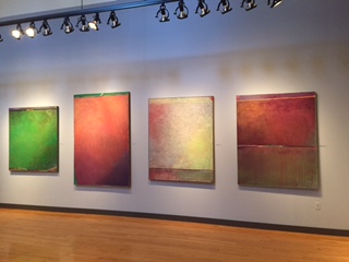
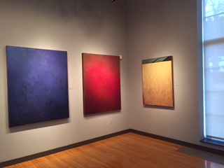
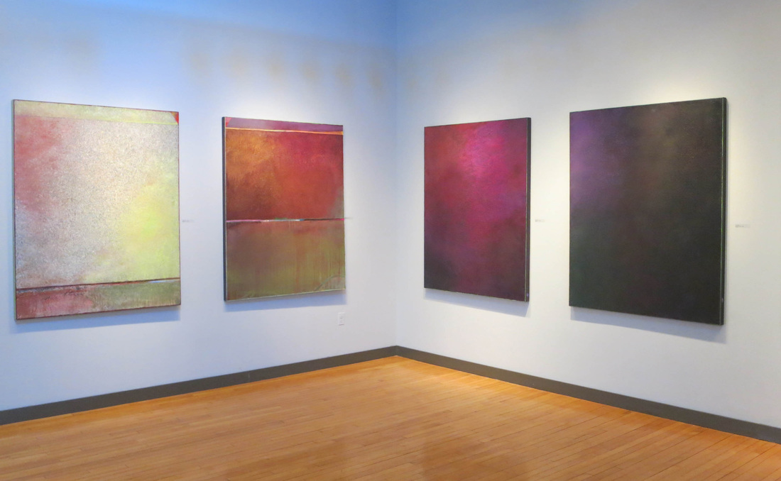
Greene’s pictures at Millbrook are different in methodology from traditional color field artists: he spritzes his layers of encaustic color onto black gessoed board instead of brushing or even spraying them. Working quickly as he must – encaustic is melted beeswax mixed with pure pigment – he gives his work a highly textured, pebble-like quality that adds the depth much color field does not have. (The encaustic also allows occasional, pleasing drips down the board.)
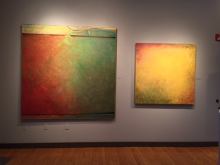
As layer upon layer of different colors are spritzed on sections of a painting, subtle gradiations of color appear, the gradiations you see in natural landscapes or even minerals. Yet these are not pictures about anything: they are paintings about feeling, about the memory of color. The beeswax gives each picture an inner glow, a luminescence that is sensual. You find yourself looking at each work longer than you expected, even turning back for another look.
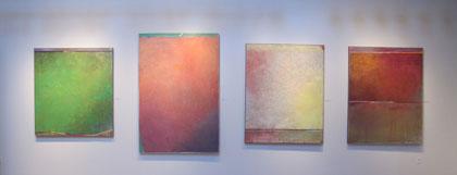
The 12 pictures in Greene’s show are mostly large. As you enter the gallery, four big works nearly scream Rothko. Only closer viewing reveals Greene’s pebbly texture with a depth Rothko never sought. Nearby are some pictures in which the color field is bracketed above and below by narrow, brush-painted, multicolored borders. There is a gorgeous painting of oranges and apricots and browns that seems to capture the intensity of a sunny, July day. And one of the intense blues of over black that recalls the depth of blue minerals.
Color field was an artistic movement of the 1950s and ‘60s. Characterized by large, flat swathes of color, it was manipulated in many different ways by artists such as Mark Rothko, Barnett Newman, Helen Frankenthaler, Robert Motherwell and Jackson Pollock, among others. Color field influence showed up in the work of later artists as well, and it is felt in some 21st-century art.
Greene’s pictures at Millbrook are different in methodology from traditional color field artists: he spritzes his layers of encaustic color onto black gessoed board instead of brushing or even spraying them. Working quickly as he must – encaustic is melted beeswax mixed with pure pigment – he gives his work a highly textured, pebble-like quality that adds the depth much color field does not have. (The encaustic also allows occasional, pleasing drips down the board.)
As layer upon layer of different colors are spritzed on sections of a painting, subtle gradiations of color appear, the gradiations you see in natural landscapes or even minerals. Yet these are not pictures about anything: they are paintings about feeling, about the memory of color. The beeswax gives each picture an inner glow, a luminescence that is sensual. You find yourself looking at each work longer than you expected, even turning back for another look.
The 12 pictures in Greene’s show are mostly large. As you enter the gallery, four big works nearly scream Rothko. Only closer viewing reveals Greene’s pebbly texture with a depth Rothko never sought. Nearby are some pictures in which the color field is bracketed above and below by narrow, brush-painted, multicolored borders. There is a gorgeous painting of oranges and apricots and browns that seems to capture the intensity of a sunny, July day. And one of the intense blues of over black that recalls the depth of blue minerals.